// SOFTWARE
Design System
A reusable SwiftUI design system for Marek's iOS apps — one dependency for consistent components, tokens, and modifiers.
[iOS][SPM]
[ESTABLISHED]v1.0.6OVERVIEW
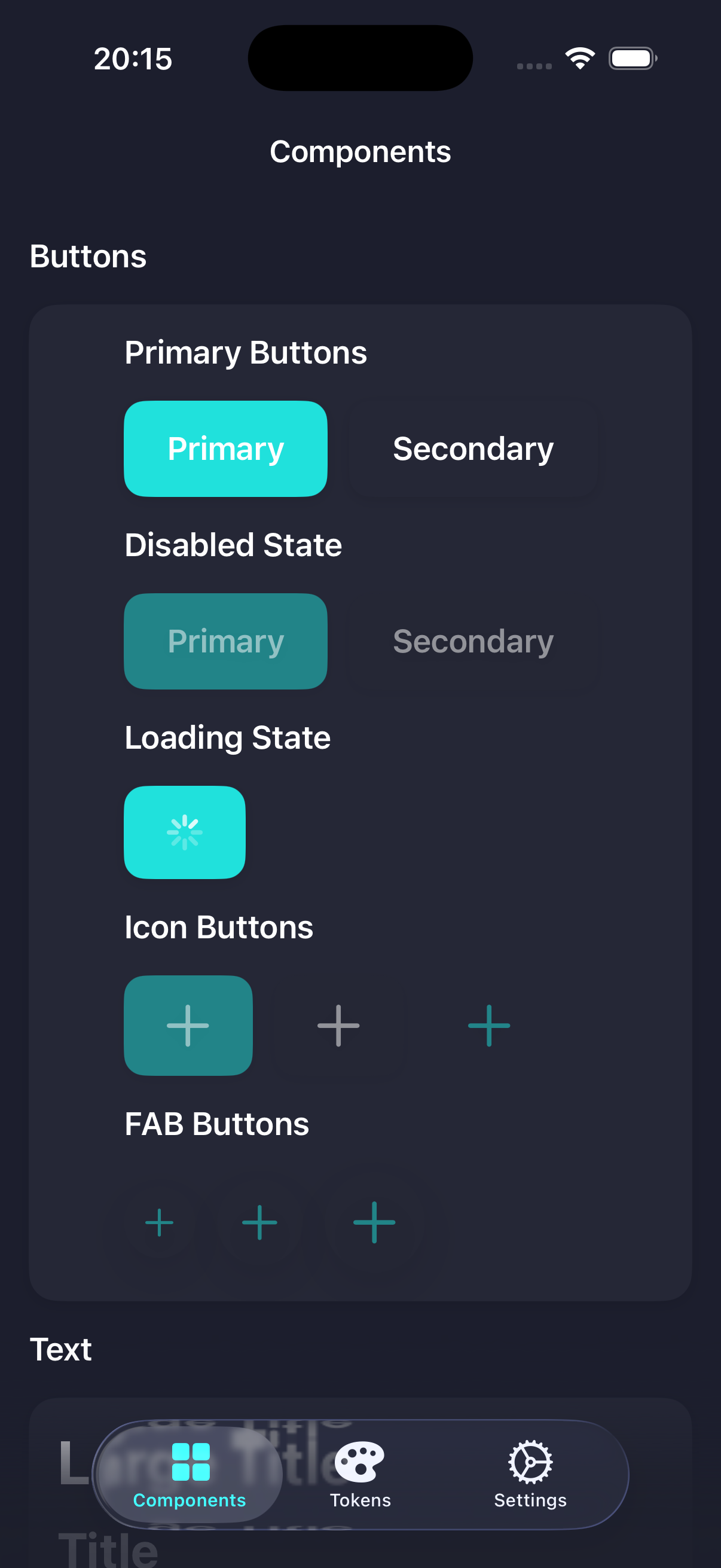
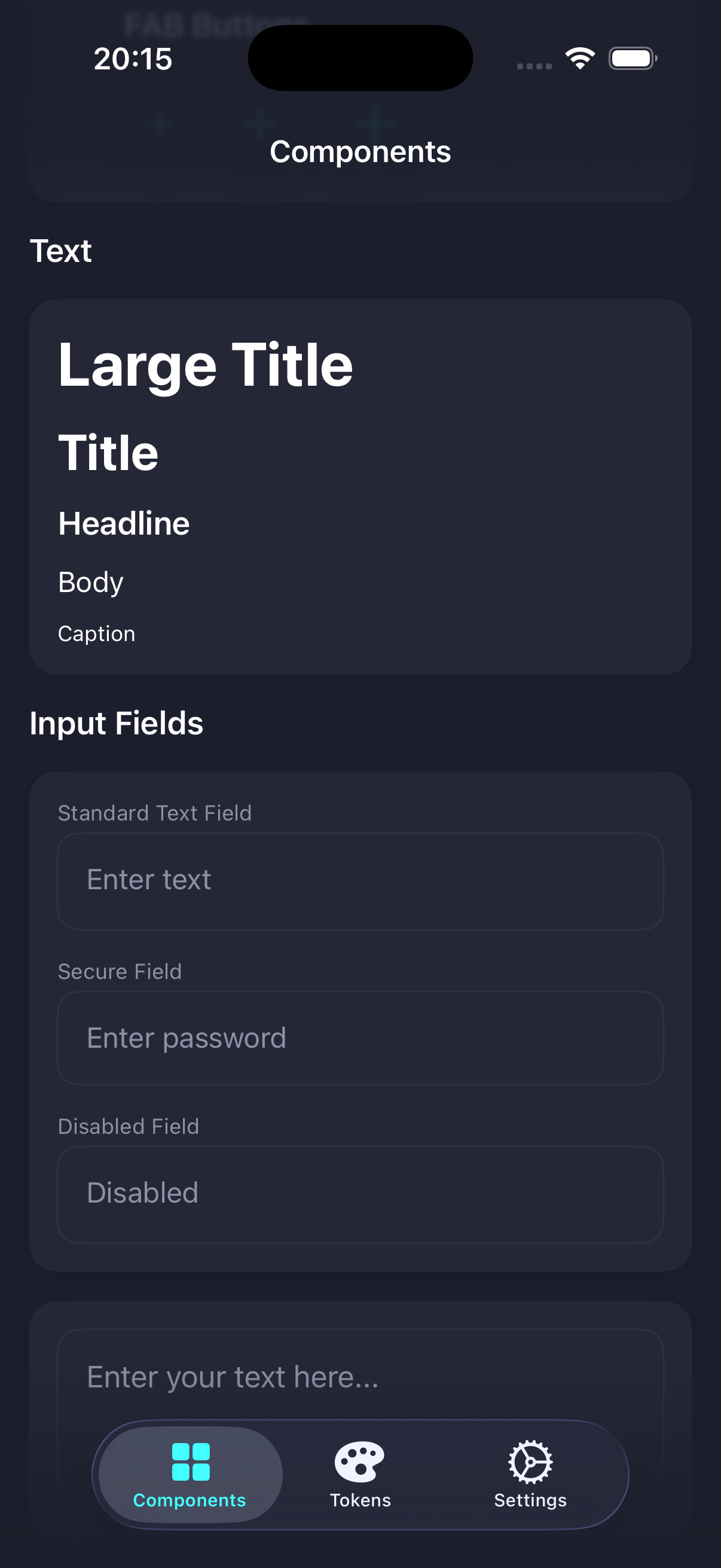
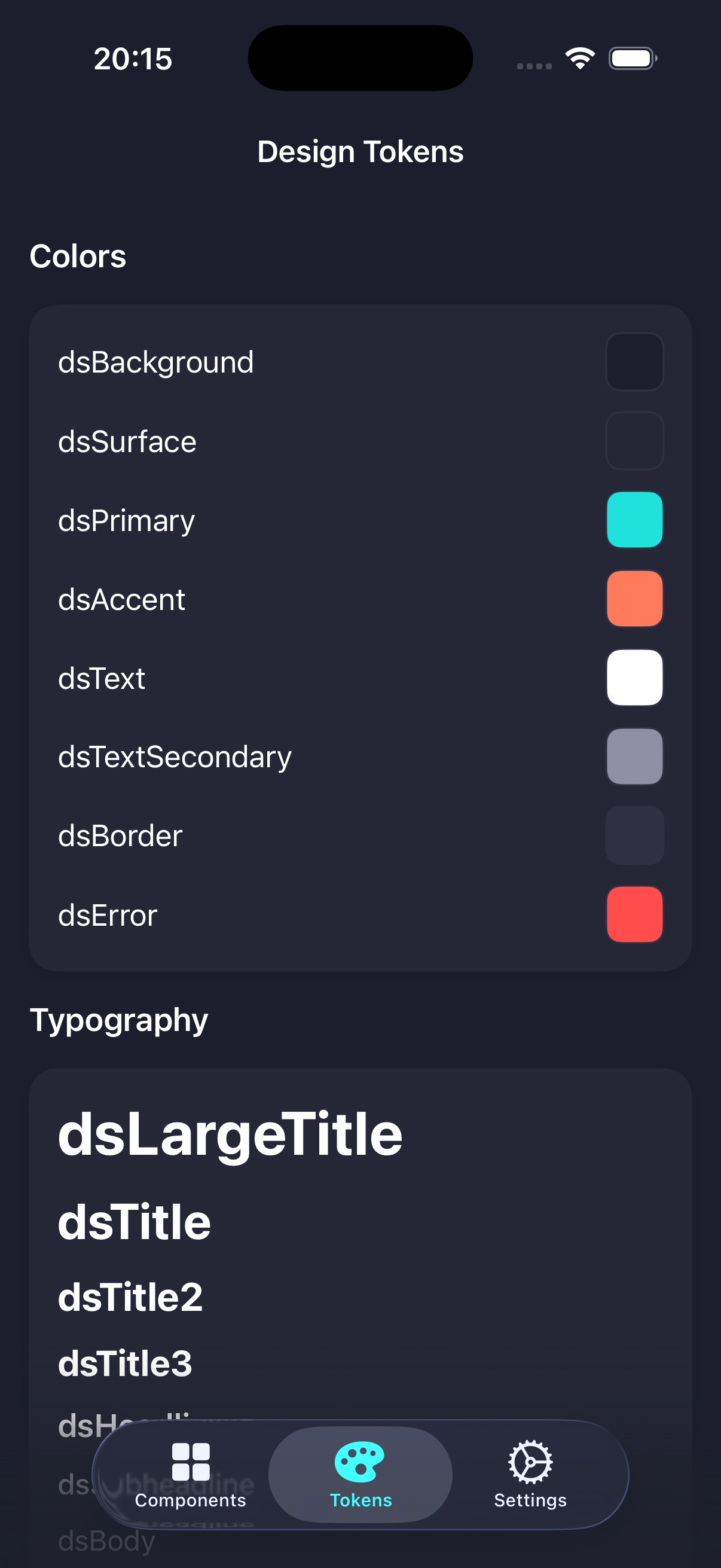
DesignSystem is a Swift Package that centralizes the SwiftUI building blocks Marek's personal iOS apps share, so new apps don't rebuild the same buttons, cards, and typography from scratch. It ships a matched set of components, dynamic light/dark-aware design tokens, and reusable view modifiers behind a single import DesignSystem. A bundled Demo app showcases and visually verifies every component and token.
FEATURES
- DSButton — customizable button with multiple sizes and variants
- DSText — typography component with predefined text styles
- DSTextField & DSTextEditor — consistent single- and multi-line text input
- DSCard & DSSection — components for grouping and organizing content
- DSTabView & DSToolbarItem — navigation and toolbar building blocks
- DSToggle & DScrollView — additional interactive and layout components
- Dynamic design tokens — light/dark-aware color, typography, and spacing
- Reusable modifiers — confirmation alerts, shadows, navigation variants, and general view helpers
SCREENSHOTS
TECHNOLOGY
Swift 6.2SwiftUISwift Package ManagerXCTestswift-snapshot-testing
Swift 6.2SwiftUISwift Package ManagerXCTestswift-snapshot-testing